(01)
SOVA®
Services
Branding / Packaging / Logo Design / Color
Year
2026
Credit
Designed by Christian Alvarado.
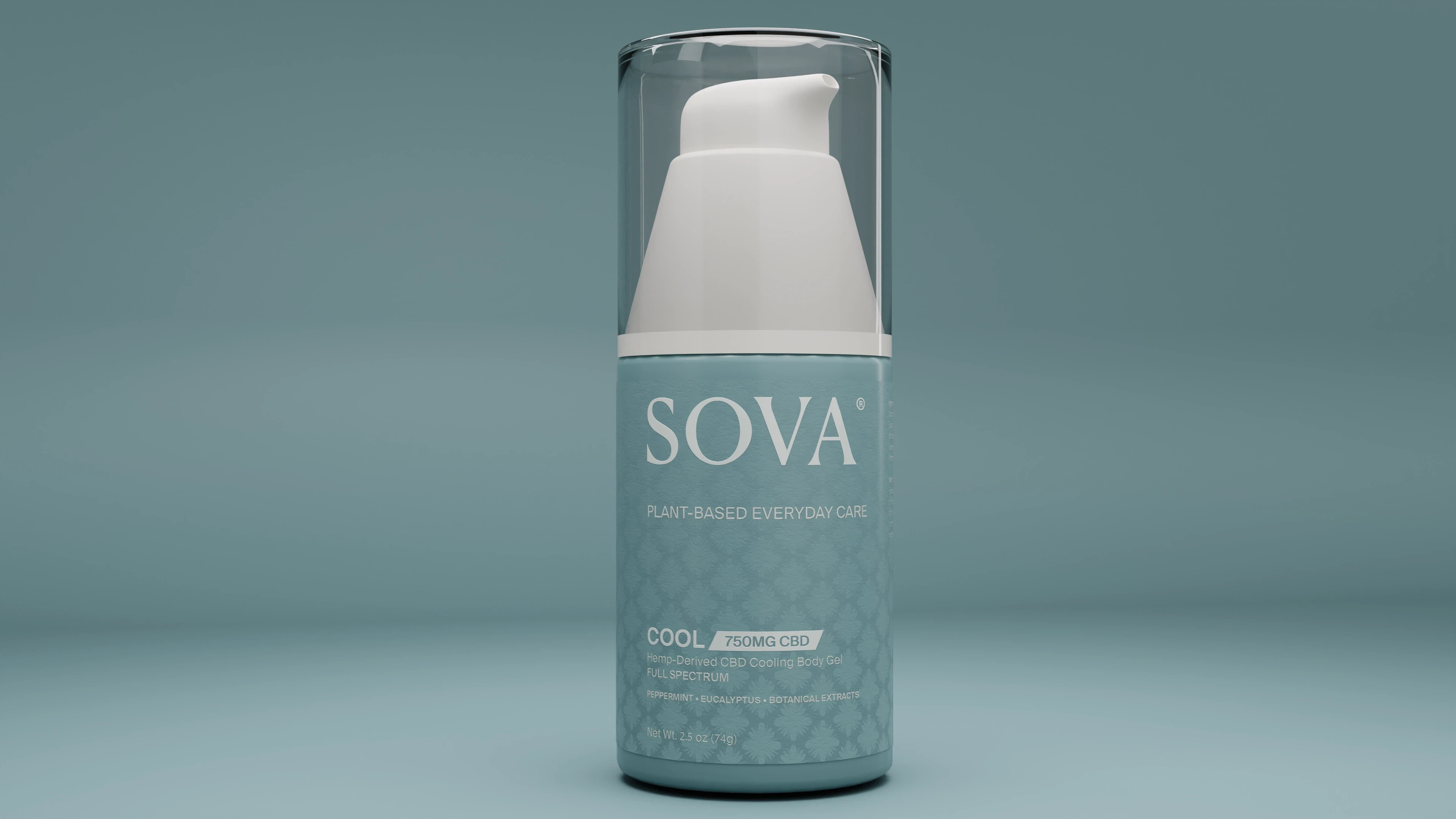
A calm, apothecary-inspired identity and packaging system for a plant-based CBD wellness line.
The challenge
CBD packaging tends to read as either clinical or overly “crunchy.” SOVA needed to feel premium and trustworthy while staying simple and everyday, across a growing line of formulas, strengths, and container types.
The work
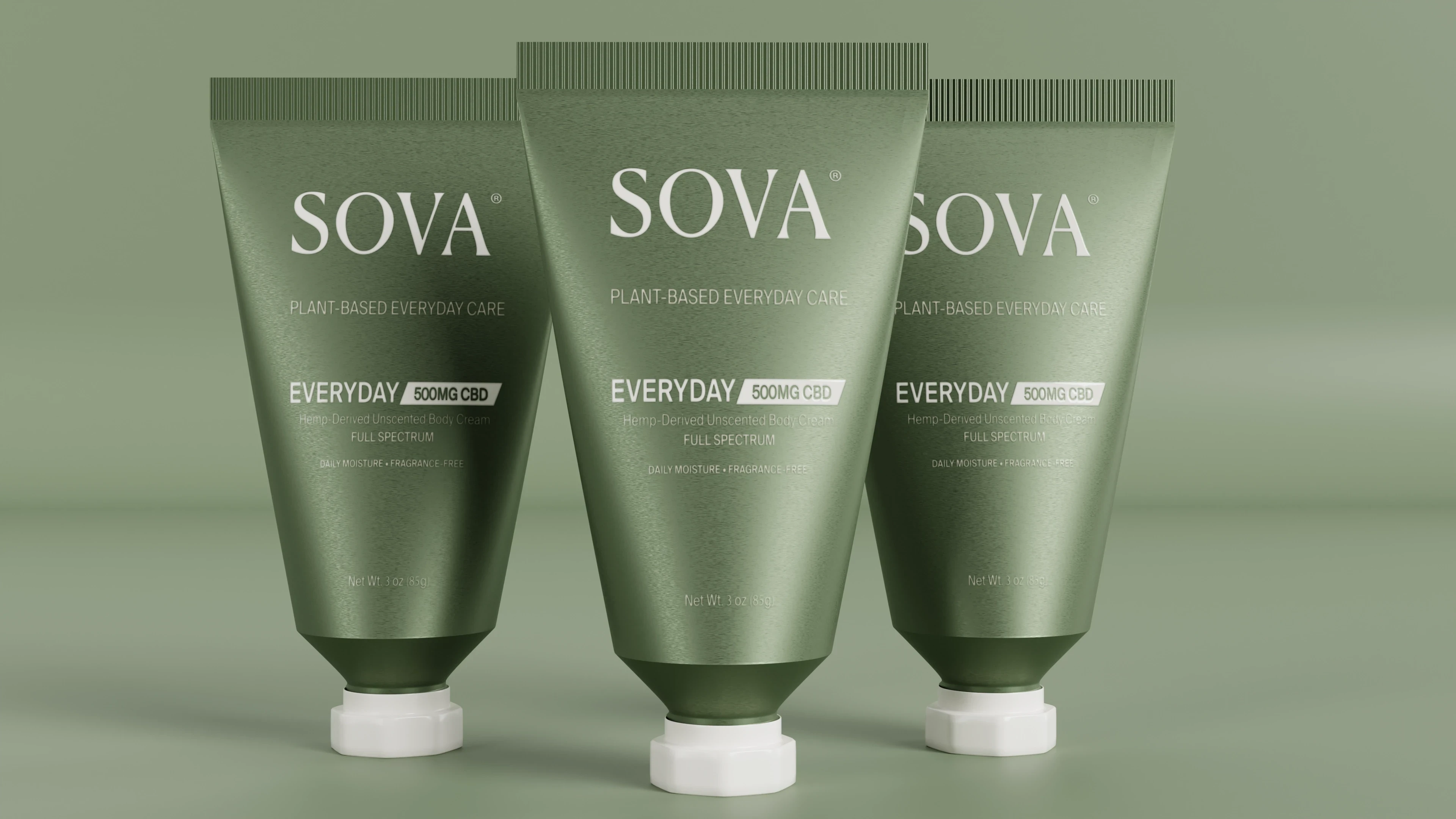
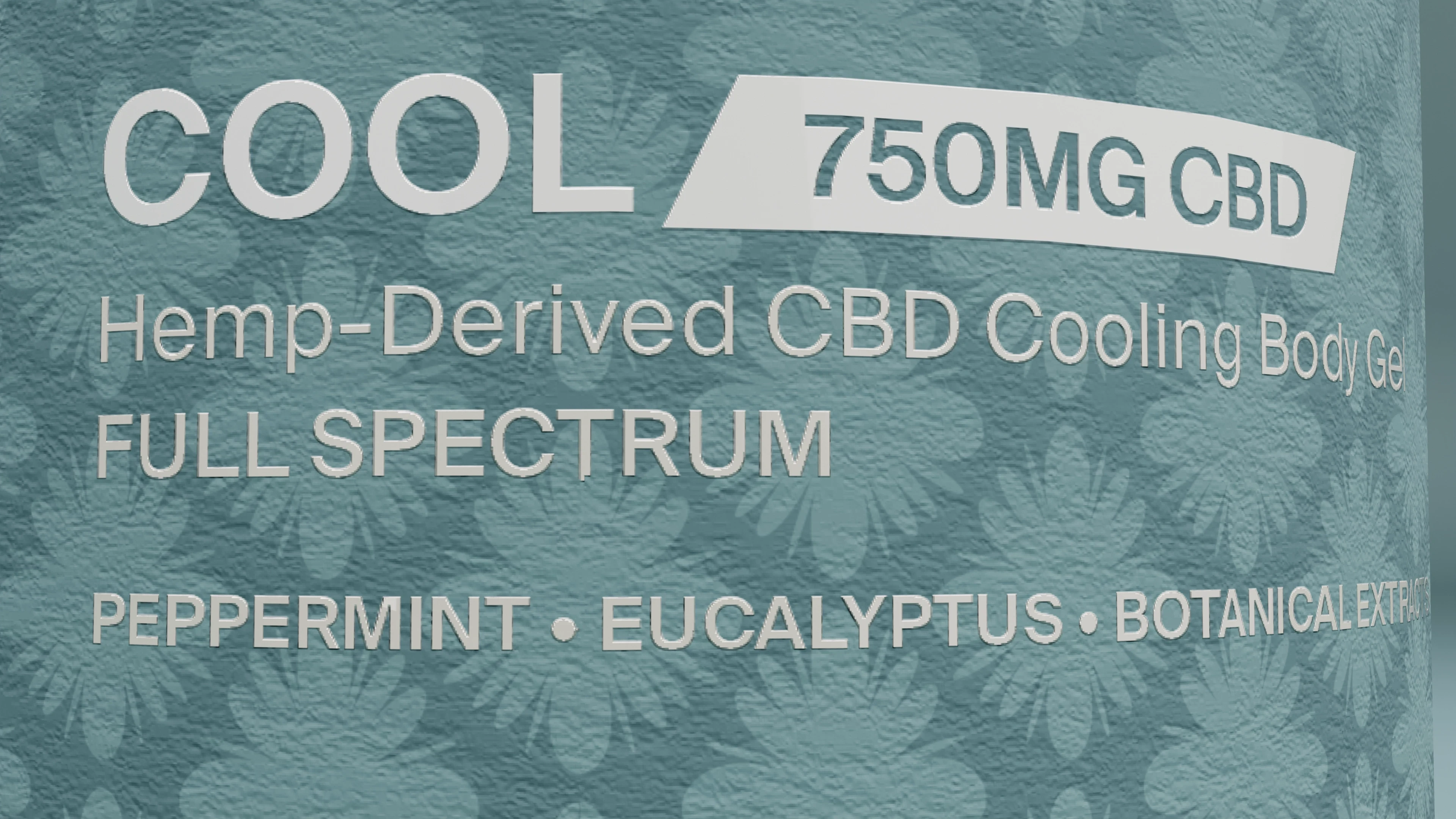
A custom serif wordmark and SV monogram, paired with a botanical damask motif drawn from a nine-color palette that runs from terracotta and gold to sage and slate. A restrained serif and grotesque pairing keeps the type quiet, so one repeating floral motif in shifting colorways can carry the line.
The result
One flexible system scales across balms, gels, and creams, and across the Ground, Cool, and Everyday formulas. Each product keeps its own identity through color alone.


(Next project)
Lucky 7
View project →